Coke Zero
Sans Sugar
Letting Coke Zero’s great taste speak for itself.
Insight
Great taste can’t always be sold.
Coke Zero has made a lot of progress in recent years convincing a broader audience to try its product. But there’s still a large amount of people who refuse to believe they’ll enjoy the taste.
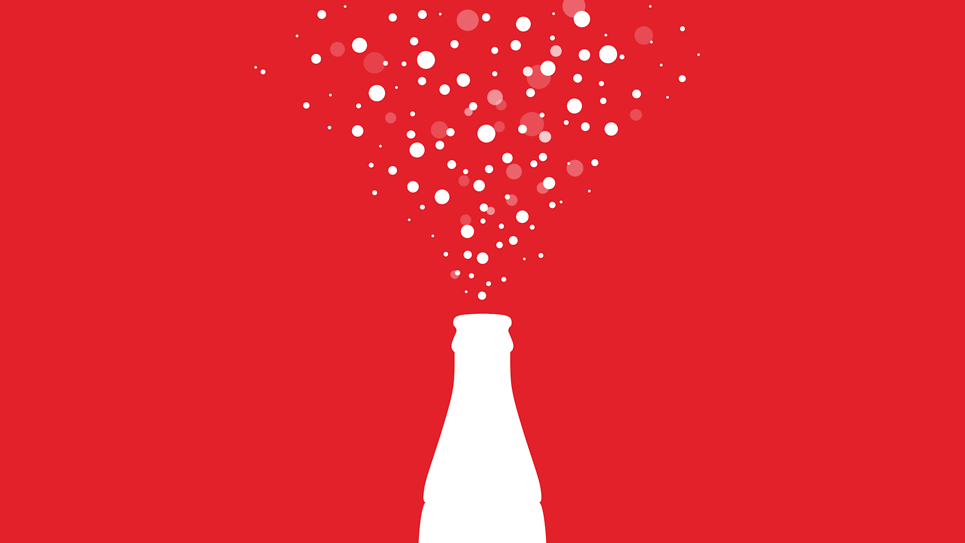
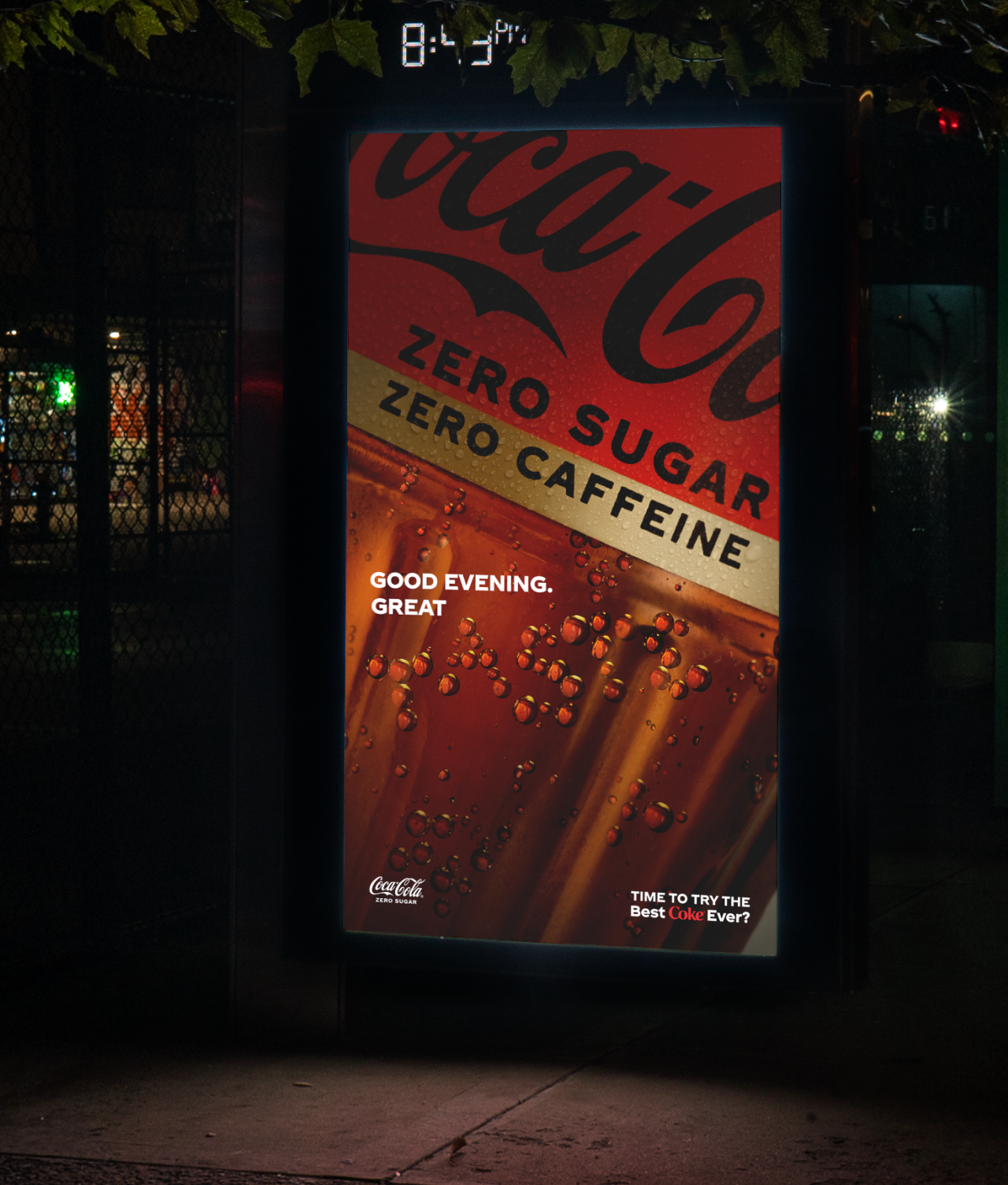
Instead of trying to convince people through traditional messaging, Coke Zero let the bubbles, fizz and condensation of the product speak for itself.

Idea
A tasty typeface, sourced from the product.
To craft key visuals, Coke Zero used cutting-edge AI technology to develop a custom Sans Sugar font, made entirely of real product elements.
A custom-designed typography used Neural Network Object Detection to find naturally-occurring letters amongst the fizz, condensation and bubbles of Coke Zero.
To develop the typeface authentically, 100,000 photos of liquid were taken through a glass and formed into various shapes. Altogether, more than 40 million liquid elements were scanned over 500 hours.
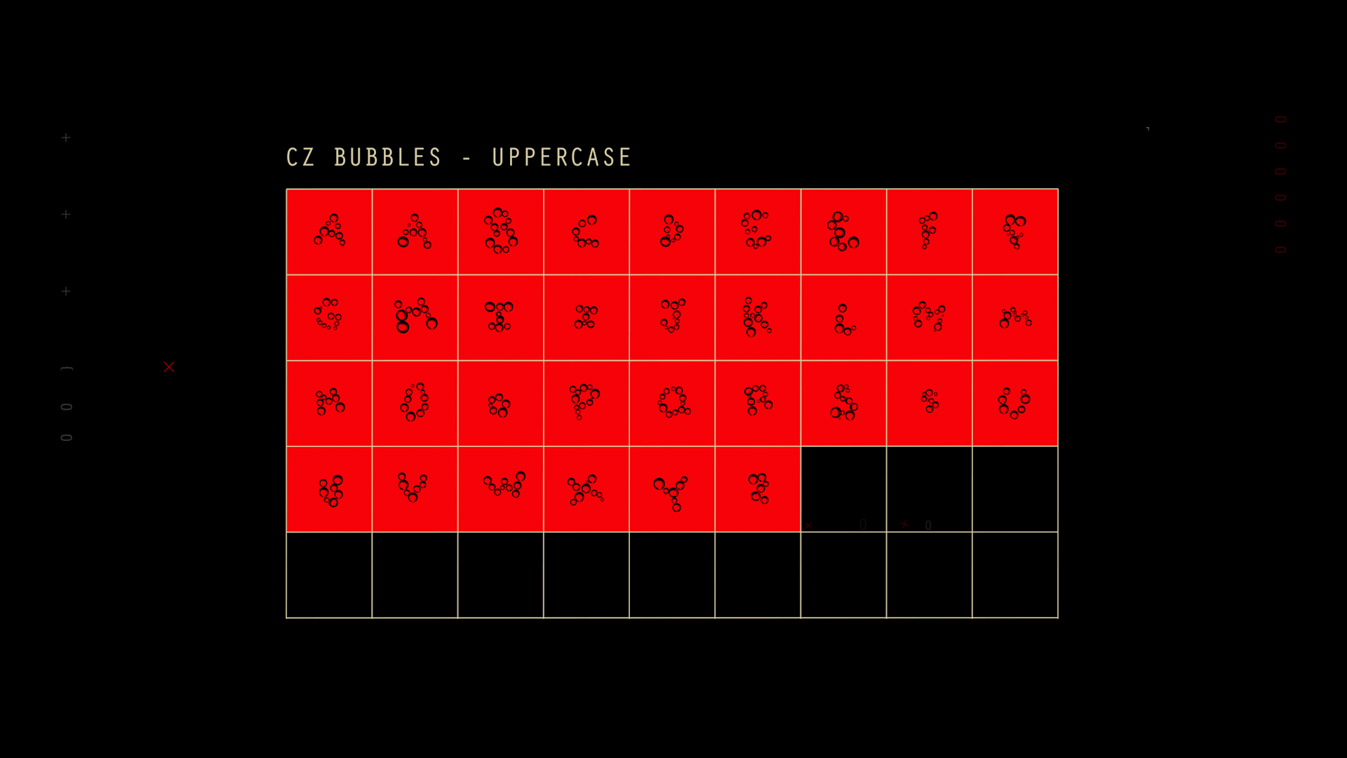
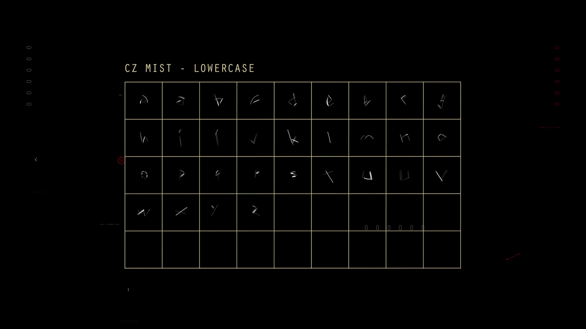
As the imagery was collected, it was compiled into a dataset, where custom software then recognised letters from the alphabets of hundreds of different languages.
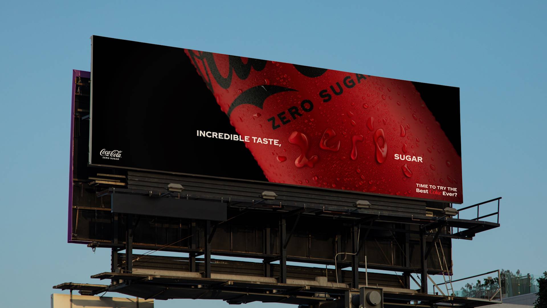
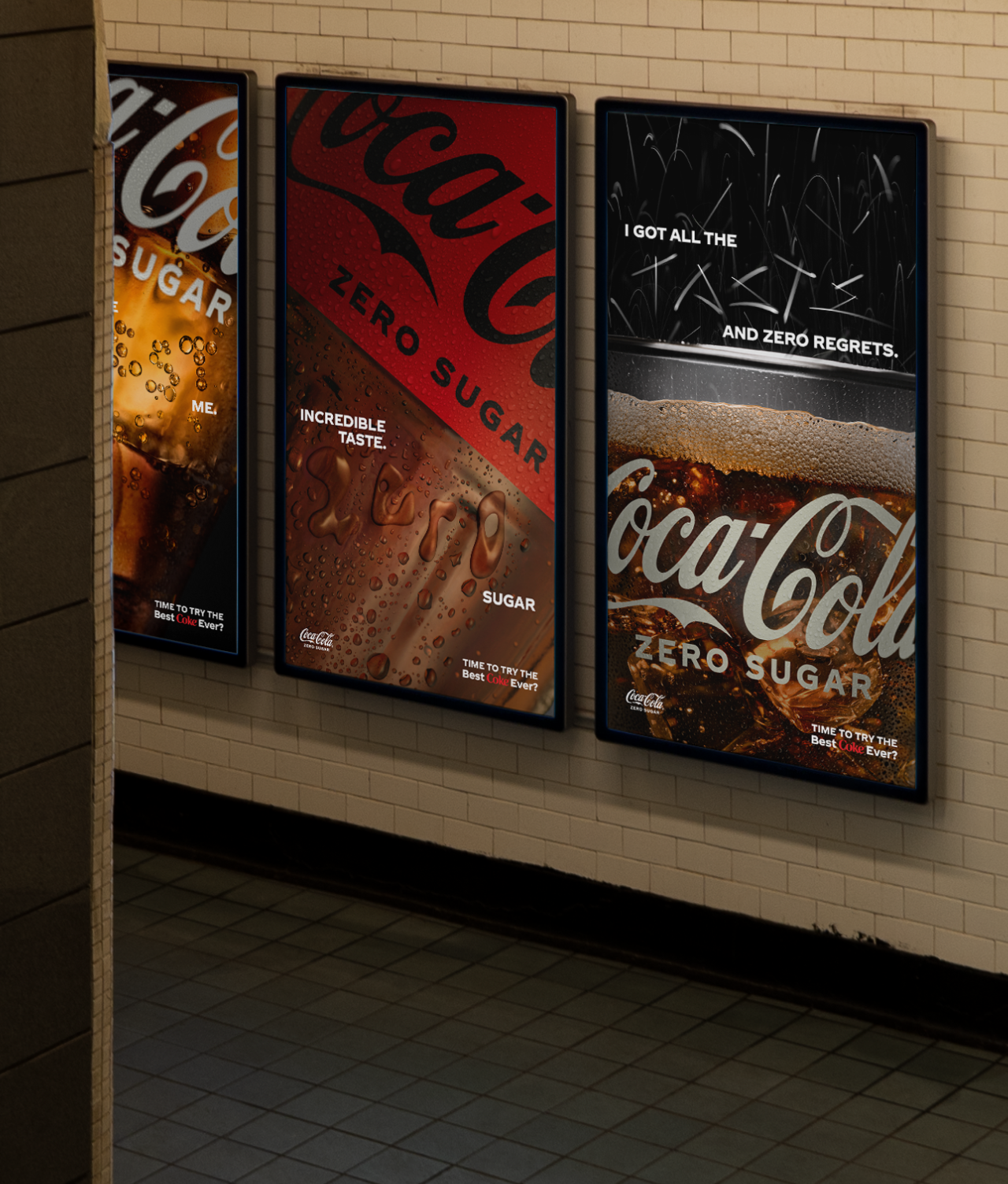
The flexible custom typography allowed Coke’s creative teams to produce print, out of home placements and digital advertisements for dozens of different markets around the world.
Impact
Taste that speaks for itself.
Coca-Cola’s brand marketing team praised the innovative approach for having the product itself at the core of the communication.
