Vodafone
A happy digital home
Redesigned to put people first.

Insight
Knowing needs is the key to stand out.
In the current climate of a saturated phone industry, people still want to find what they need right away. To provide clear solutions and be chosen among the crowd, Vodafone can count on years of being reliable, trusted and familiar.
Idea
A happy home with everything you need.
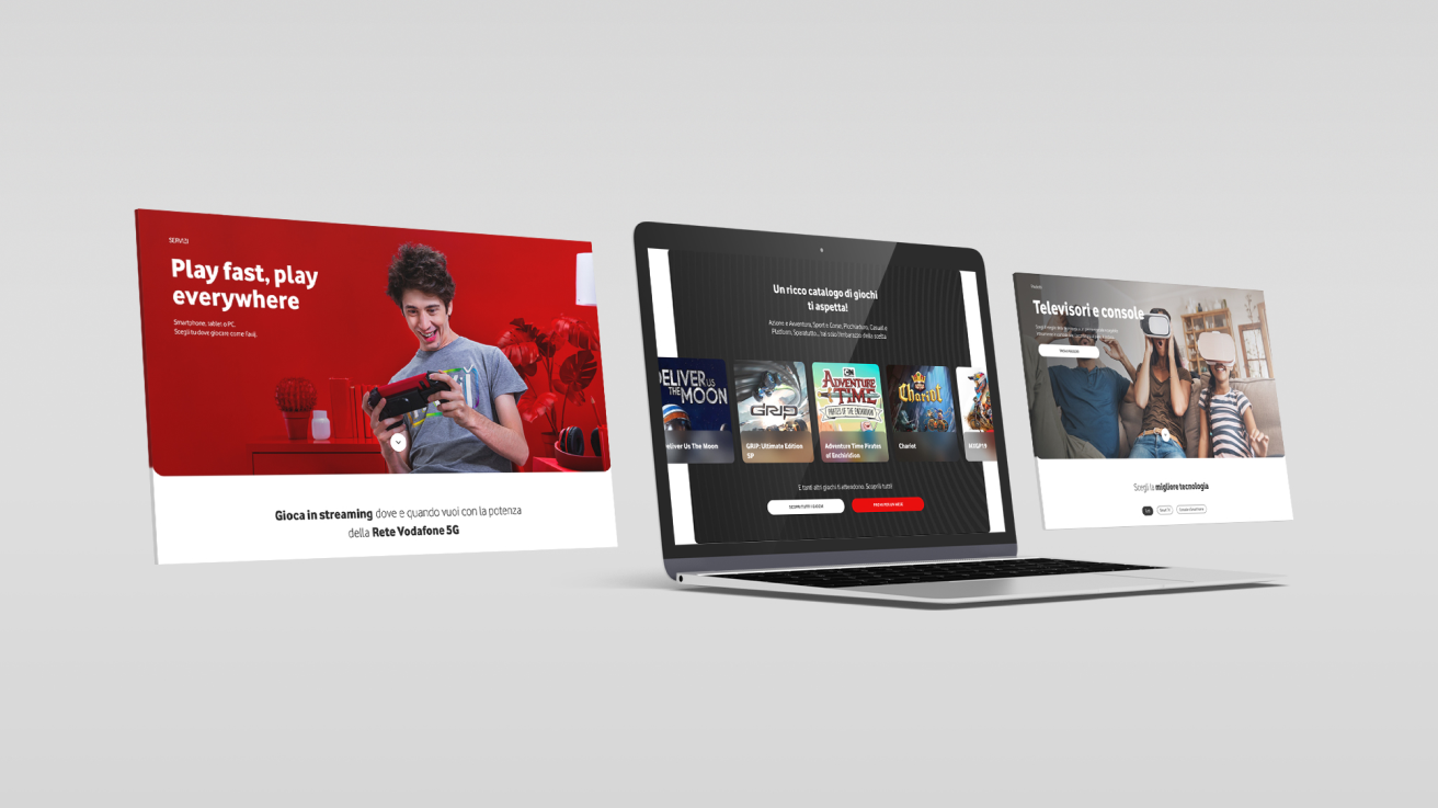
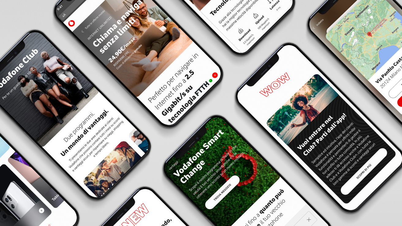
The redesign of Vodafone’s Italian website was crafted through close analysis and optimisation of visitor journeys, resulting in an intuitive environment where everything is at hand.
The principle of feelings before product is crucial in inspiring people to choose Vodafone. As they land on the homepage, offers can easily be swiped through and an authentic relationship with Vodafone can be built.
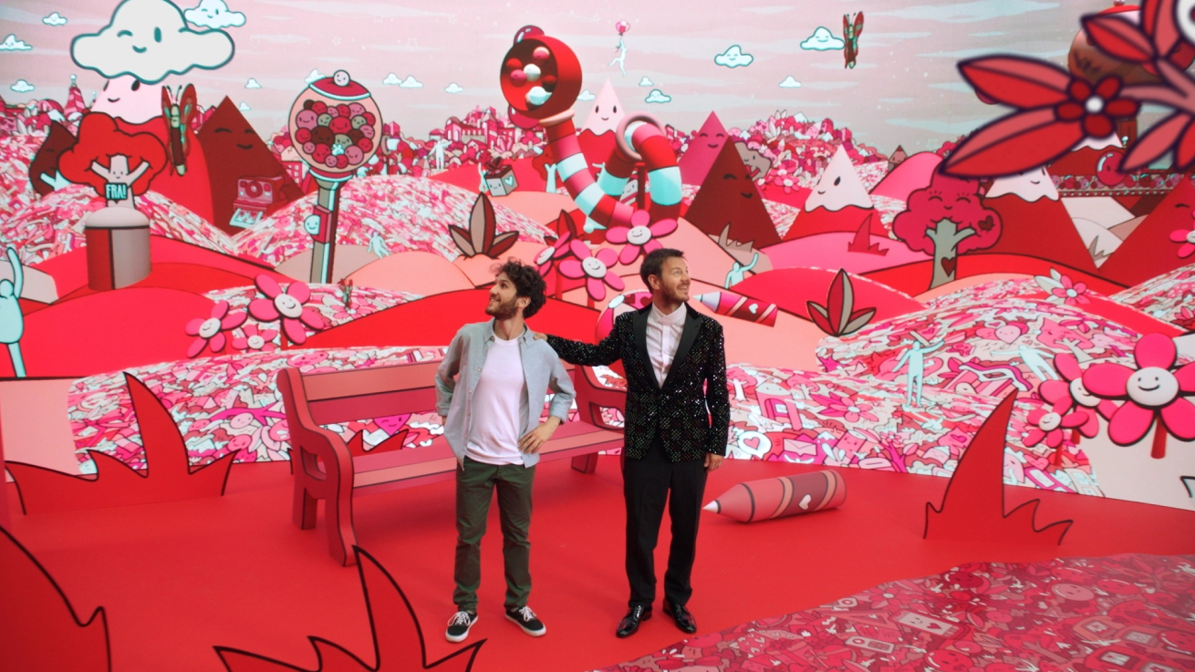
Products and services like the Vodafone Happy loyalty programme are presented through the lens of Vodafone’s values and tone of voice. Fun is the underlying theme of the visuals, while simplicity and warmth guide the choice of each headline or call to action.
Impact
Welcome to a world of possibility.
While Vodafone’s language and imagery are still familiar, the dynamic structure and smooth interactions that populate the website fill the navigation with a sense of possibility. Every piece of information is transparent and accessible, proving that Vodafone has truly known its loyal audience for a long time.
