Show me all Nike projects
Home

WebexThe look of collaboration

Insight

Webex’s vibrant remote culture keeps us connected.

With its superior trust, collaboration and security, Webex by Cisco revolutionised unified communication as a service for the enterprise. The new visual identity for Webex has universal appeal, reflecting, and encouraging, a new era of inclusive hybrid work.


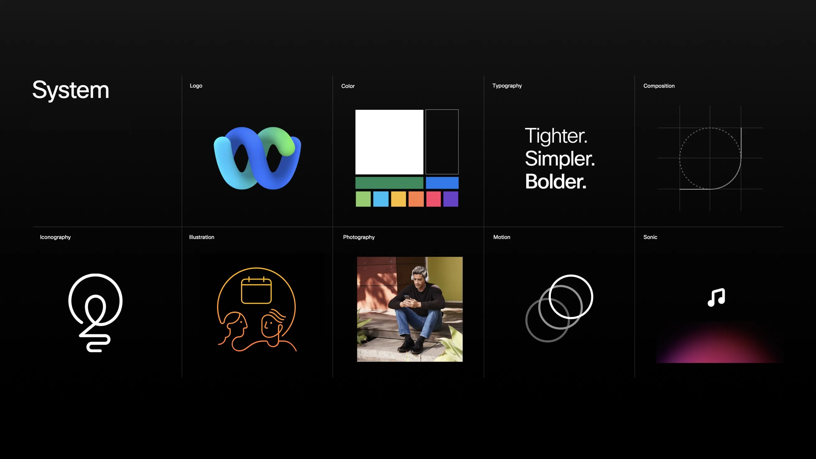
A black grid displays elements of a design system: logo, color palette, typography reading Tighter. Simpler. Bolder., composition grid, iconography, illustration, photography, motion rings, and a musical note for sonic.
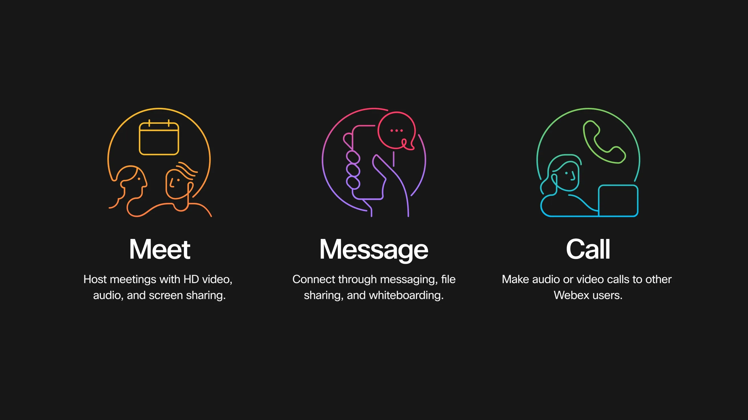
Three icons on a dark background: an orange Meet icon with calendar and people, a purple Message icon with a hand holding a phone, and a green Call icon with a phone and people. Each has descriptive text below.

The power of inclusivity.

The platform already removes barriers of geography, language and differing work styles to allow everyone an opportunity to contribute, collaborate and perform at their best. The identity system evokes that spirit, ensuring the ability to communicate warmth and welcome humanity.


Idea

Weaving the pieces together.

The identity is based around four founding design principles: it is seamless, vibrant, focused and personalised. The seamless interlace of curves symbolise collaboration while the colour palette, gradients and photography bring energy and vibrancy. The choice of high-contrast, black and white canvases and composition principles ensure visitors can easily focus on what matters most.


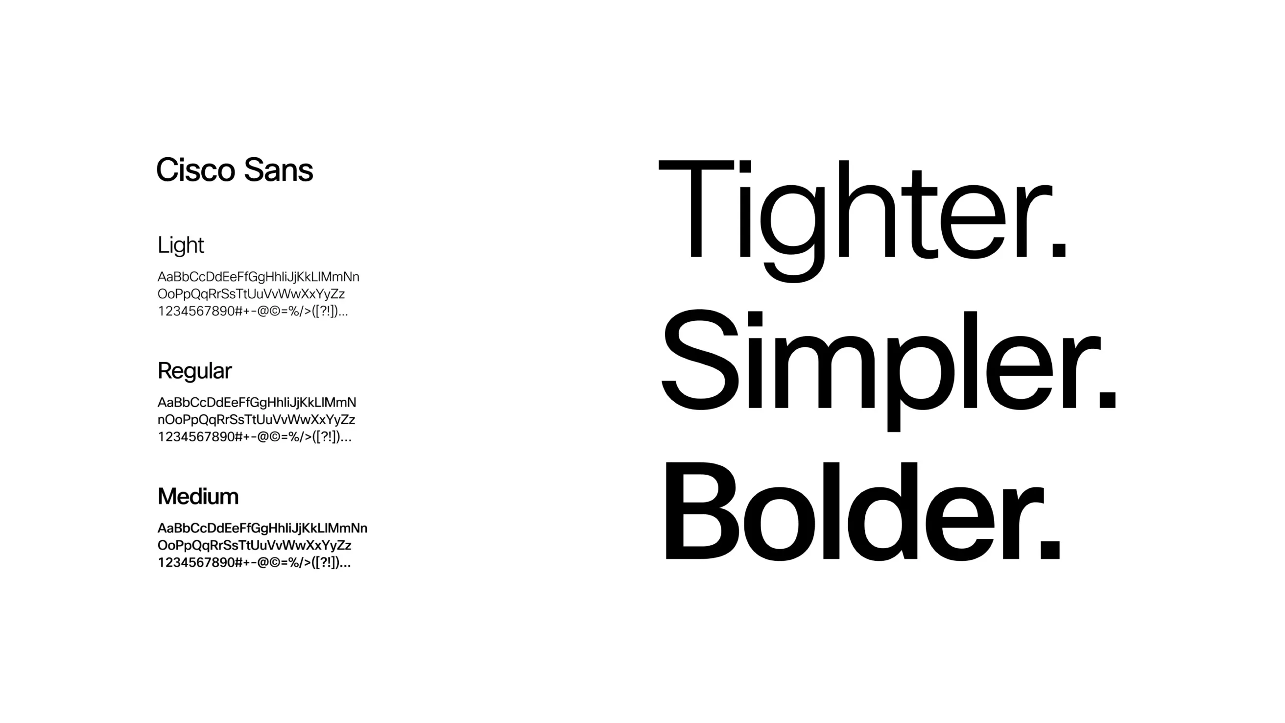
Sample of Cisco Sans font on the left in Light, Regular, and Medium weights; on the right, large bold text reads Tighter. Simpler. Bolder. on a white background.
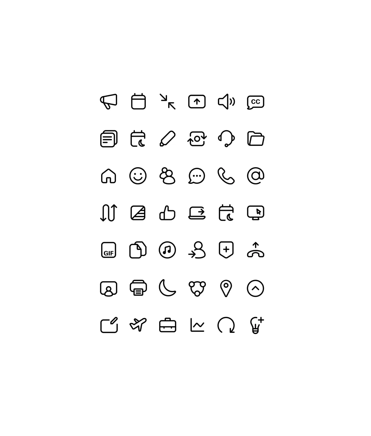
A grid of 40 black, minimalist icons on a white background, including calendar, chat, pencil, user, folder, smiley face, thumbs up, phone, envelope, music note, location pin, airplane, briefcase, lightbulb, and more.
Two speech bubbles, one with the letter A and the other with a globe icon, appear above the text Inclusivity in real time on a black background. The words real time are highlighted in purple.
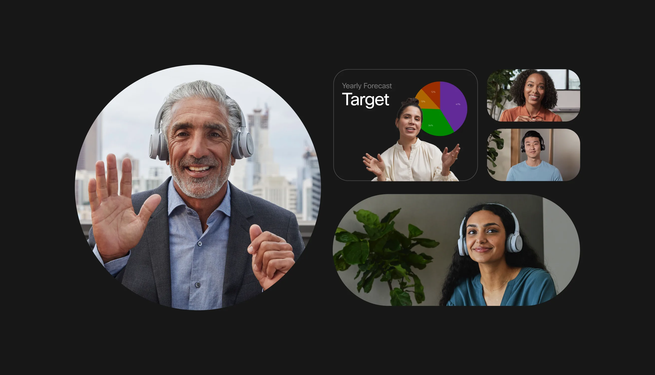
A man wearing headphones waves during a video call, while four other people appear in smaller frames, including one presenting a chart labeled Yearly Forecast Target.

An in-built flexibility allows individual expression through colour choices and customisable elements. The design system is paired with tone of voice principles so that words and visuals work in harmony. Copy is empathetic and spirited showing how Webex is diligent and open to new possibilities.


One year ago we embarked on a journey to create a new Webex brand experience and we’ve made great progress in our quest to win back the market we created. Thank you for your partnership, we couldn’t have made it to the finish line without you.
- Aruna Ravichandran, Chief Marketing Officer, Webex by Cisco
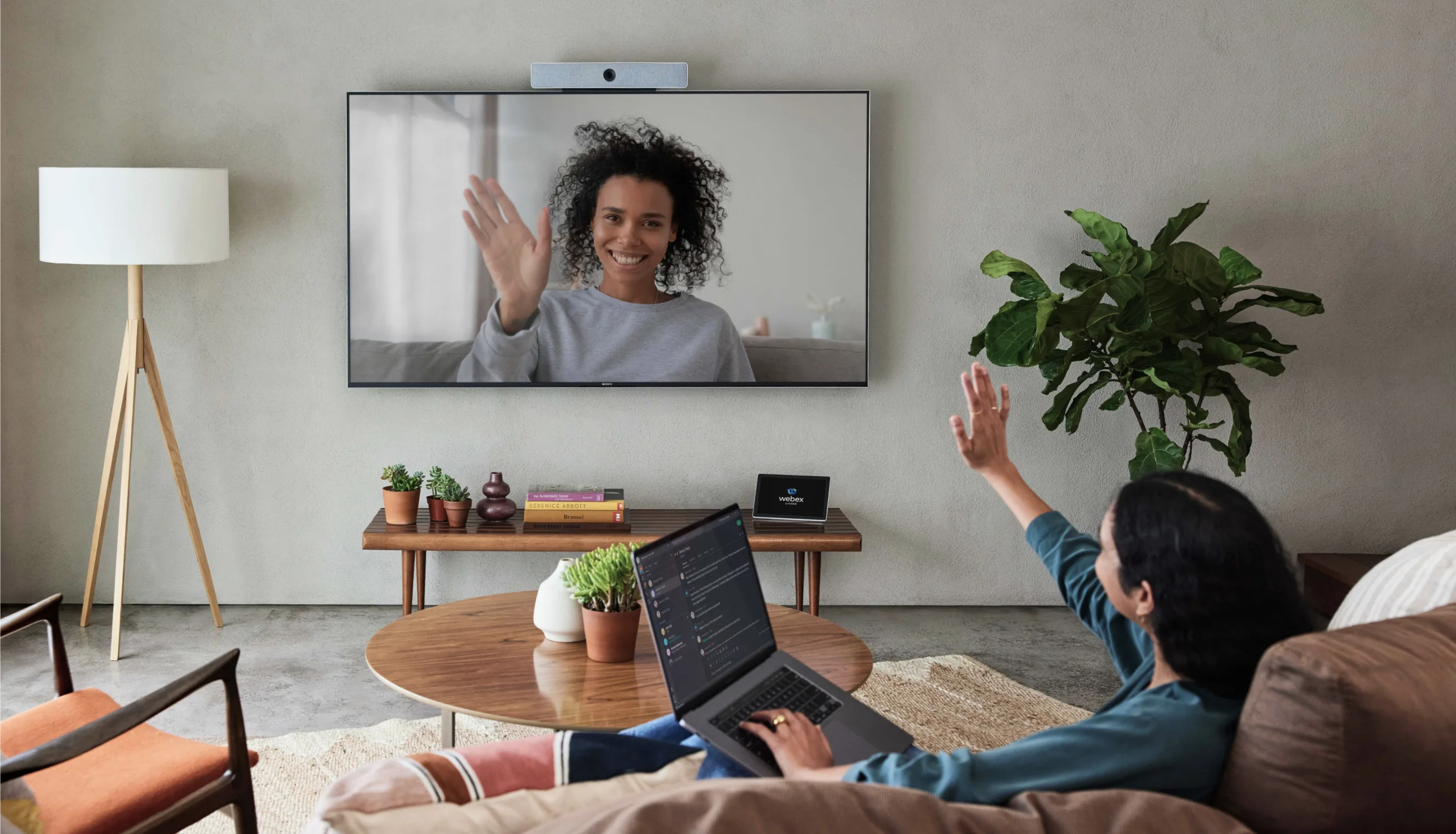
A person sits on a couch with a laptop, waving at a woman on a large wall-mounted screen during a video call. The living room has plants, a coffee table, and modern decor.
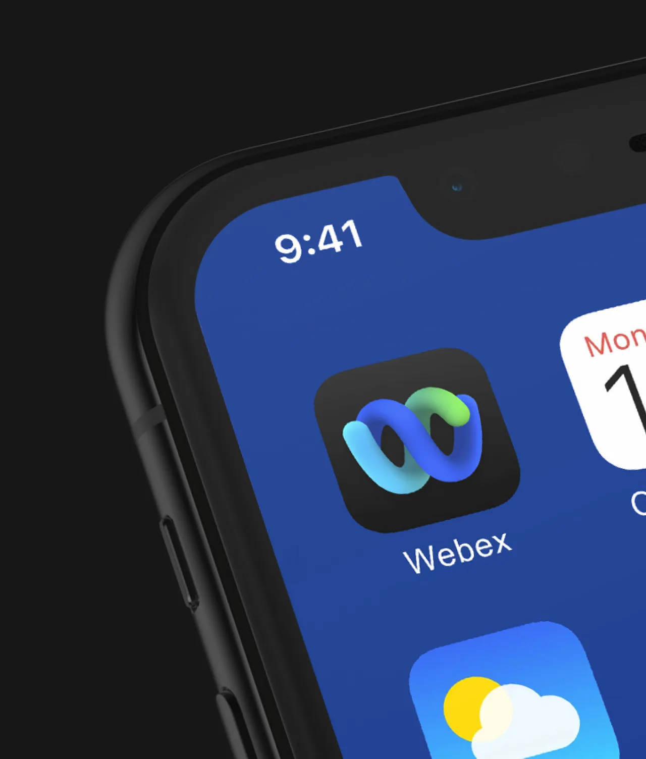
Close-up of a smartphone screen showing the Webex app icon, the Weather app icon, and the time displayed as 9:41 in the top left corner. The screen background is blue.
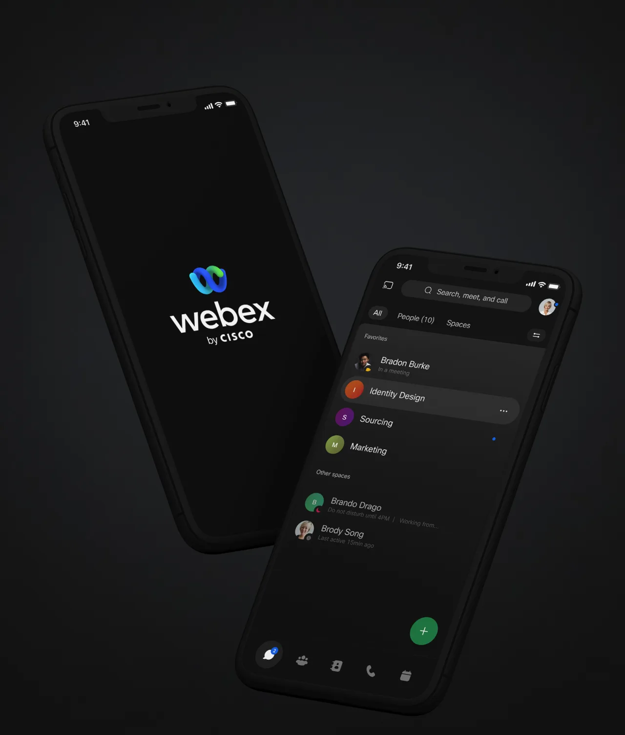
Two smartphones display Webex by Cisco; one shows the Webex logo on a dark screen, while the other shows a chat interface with contacts and colored labels under Spaces. Both devices are set against a dark background.

Impact

Built for fluidity.

At the centre of the rebrand is the logo, a seamless W representing two forms coming together, with space left between the elements to represent remote collaboration. The design is paired with a new colour palette, font, icon and illustration system, a photography suite, audio branding and motion principles.


Elements are able to be arranged in flexible ways that ensure visual variety and the ability to tailor design to the needs of a particular platform while at the same time maintaining a familiar look and feel. The system is not rigid to identikit designs rules, Webex can meet the needs of the brand and be relevant across a variety of audiences, geographies and topics. This fluidity means the system has been used to create bespoke solutions for channels such as the Platform UI, Webex.com, Webex One branding and Webex’s Hybrid Work Experience Centre.


  • 3.7k

    System assets created

  • 200+

    Brand guideline pages

  • 48

    People involved internationally

  • 100%

    Remote with the Webex app

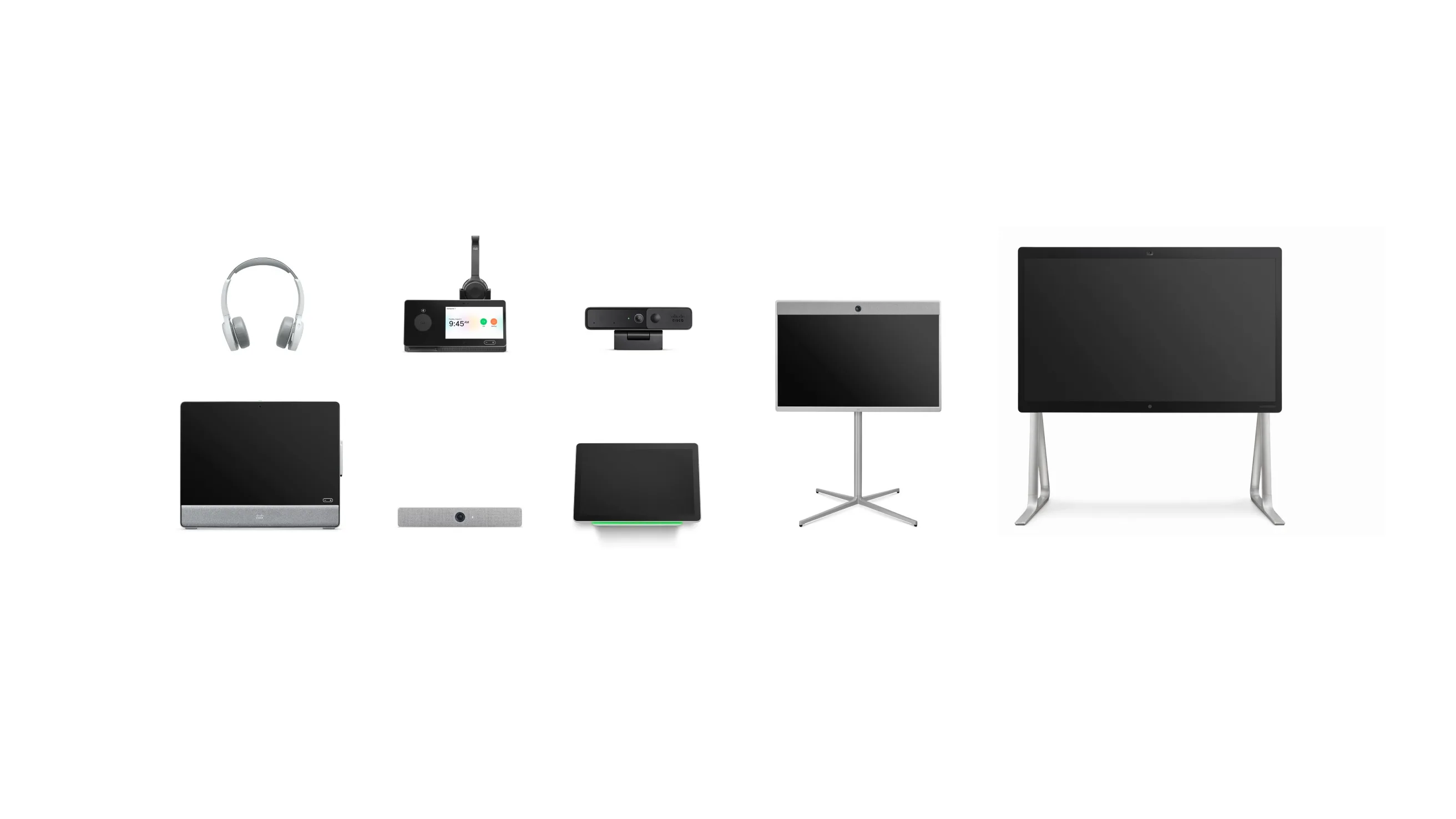
A collection of video conferencing devices and accessories, including headphones, cameras, screens, and smart panels, arranged in two rows on a white background.
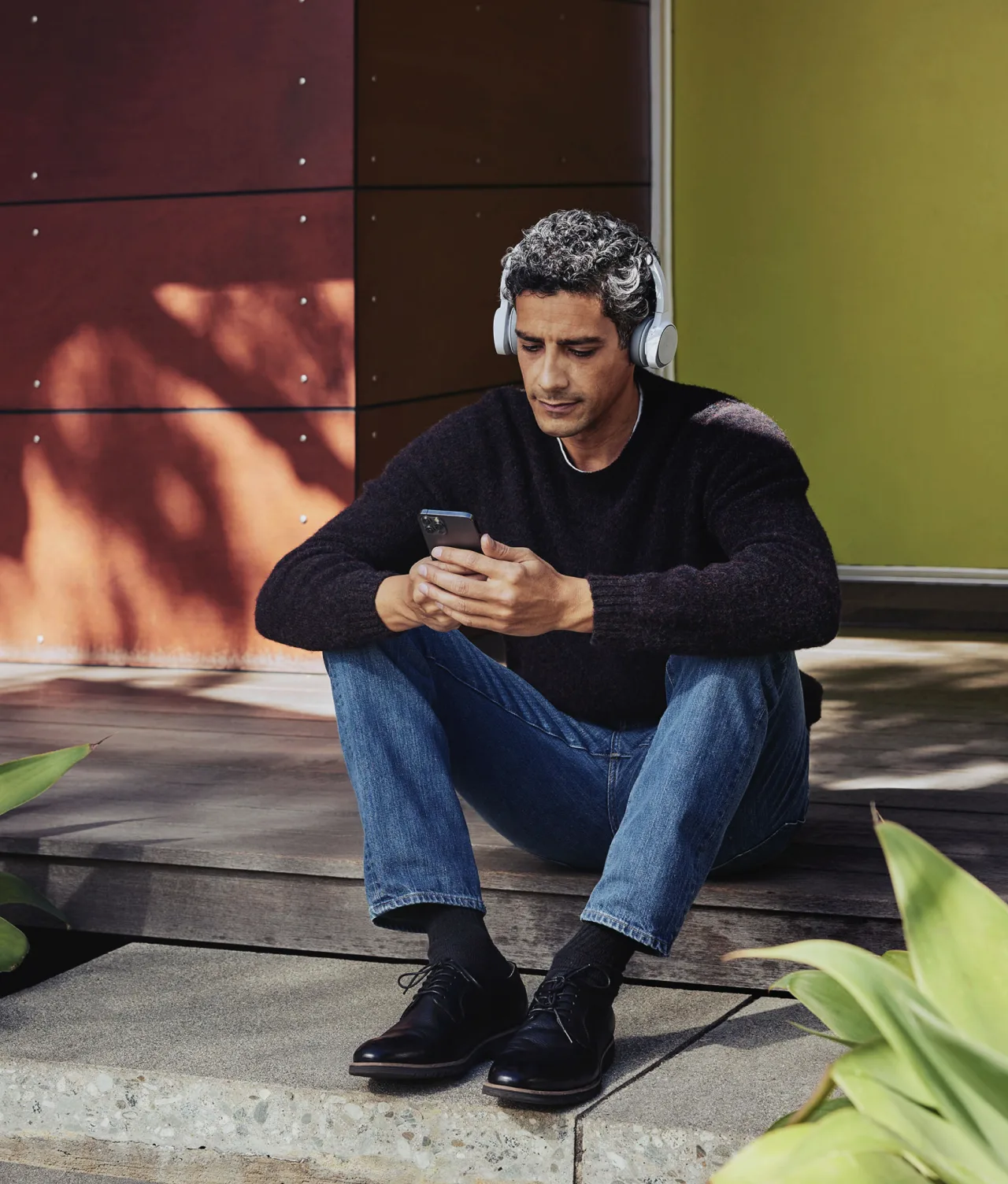
A man with curly hair sits on concrete steps, wearing headphones, a dark sweater, and jeans. He looks at his smartphone. Green plants and modern building panels are in the background.
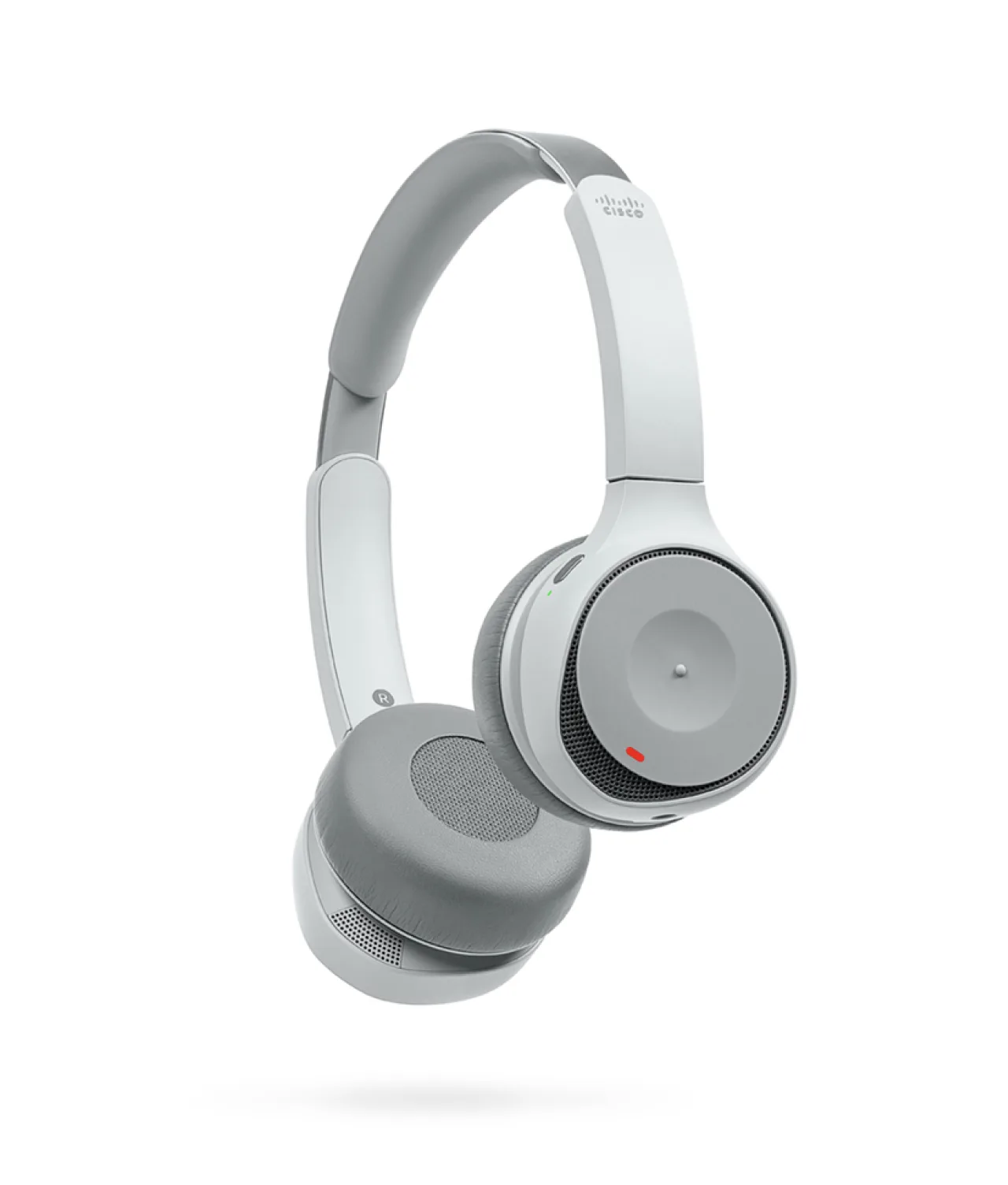
A pair of modern, over-ear, wireless headphones in light gray with cushioned ear pads and a built-in microphone, shown floating against a white background.
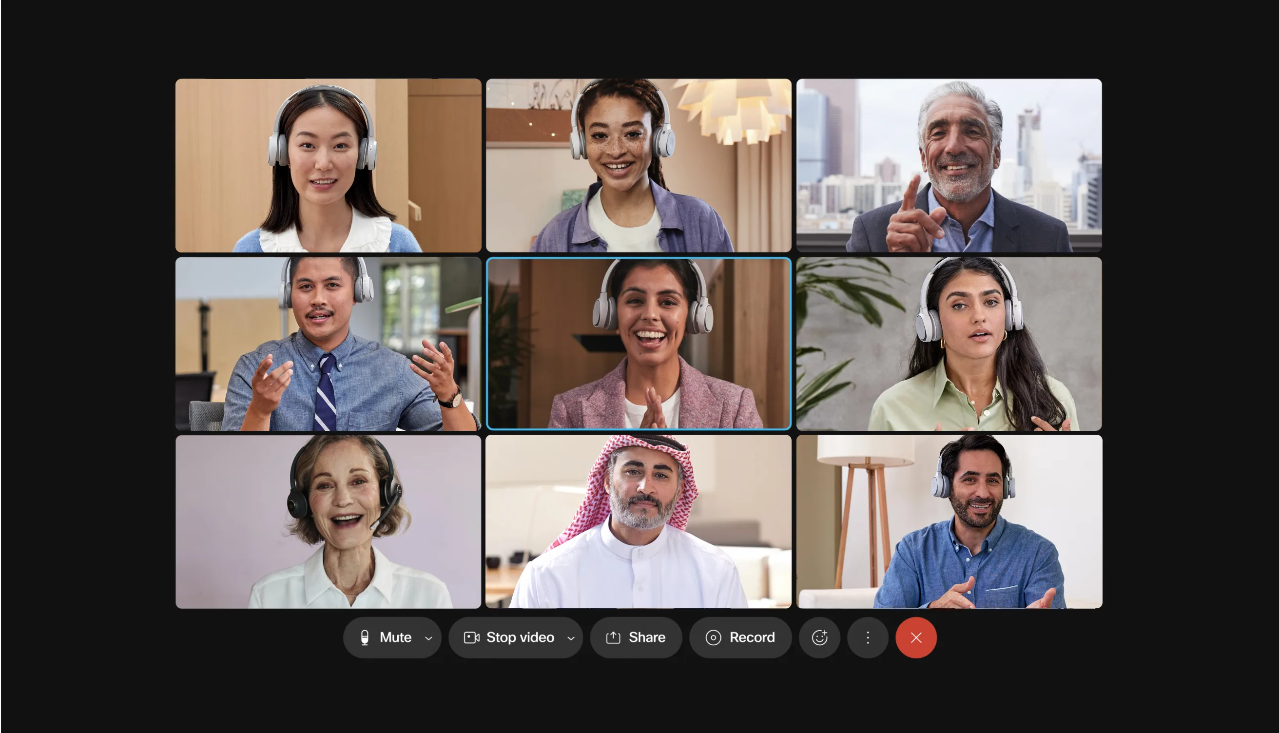
A diverse group of nine people participates in a video conference call, each visible in their own video window, smiling and engaging from different indoor locations. Meeting controls are visible at the bottom of the screen.

  • ForbesWebex goes big with new aspirations, capabilities, brand, and a campaign ↘
  • ZD NetWebex is getting an updated look and logo, reflecting the brand’s commitment to inclusivity ↘

RelatedWork

Radio Television Luxembourg

United

rtl case study card v3

MARV

Visual Identity

MARV Cover

IBM Watson

Brand identity evolution

IBM watsonBrandTool

Louis Vuitton

The LV App

LV RUNWAY

What’s yournext frontier?

Footer Fallback Image Gradient
  • Privacy Policy
  • Cookie Policy
  • Perspectives
  • AKQA Companies
  • Sustainability
  • News